The People Indoor Bias Map assumes that certain meteorological conditions generally result in people staying mainly in confined indoor spaces, while other meteorological conditions result in people spending time predominantly outside.
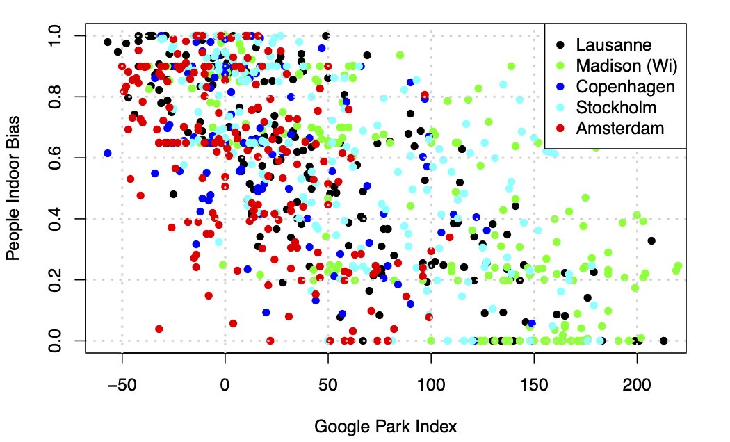
The People Indoor Bias can explain 50% - 80% of people’s behaviour of being indoors or outdoors, as demonstrated in a larger study correlating weather data with Google parks data from 5 large cities in 2 climate zones over 8 months of 2020, as illustrated below:

The People Indoor Bias map indicates when and where the meteorological conditions will be more likely to make people spend time indoors (legend= red, instead of outdoors= green), a behaviour that is likely to increase the risk of transmitting coronavirus SARS-CoV-2 (Covid-19).
See what People Indoor Bias says about your area!
Would you like to display this map on your website? Visit our widget map page and follow the instructions to implement the widget.
