Although climate change has been a "hot" topic for some time - and is this week with the ongoing COP26 - it is sometimes still perceived as a somewhat abstract and obscure phenomenon. Therefore, meteoblue launches a Climate Change diagram, which shows you the 40-year climate trend for temperature and precipitation - in unprecedented detail and scope - for any place in the world, which you can easily select in the search box at the top of the page.
The diagrams show the monthly and yearly developments, based on the data from ERA5, a historical reanalysis model by the European Centre for Medium-Range Weather Forecasts (ECMWF), which provides high accuracy weather data from 1979 to the past year, with a spatial resolution of 30 km.
On our Climate Change page, you can find four charts. The first one visualises the developments of the mean yearly temperature (the purple curve), the general trend (the dashed blue line) as well as the vertical "warming anomaly" stripes - the colour-coded yearly overview of the temperature change. The colour red indicates an increase while blue means decrease as compared to the mean values. (See the example for Basel, Switzerland, below.)

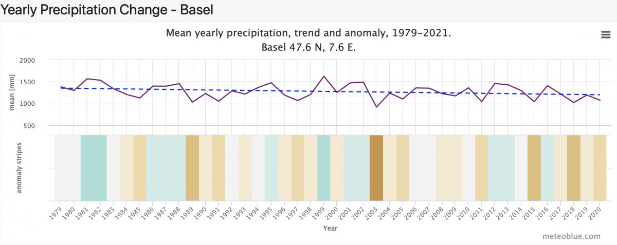
The second chart displays the trends in precipitation. Again, you can see the absolute amounts for each year, the general trend, and the precipitation anomaly stripes, which indicate each year's increase (green) or decrease (brown) in precipitation (example below).
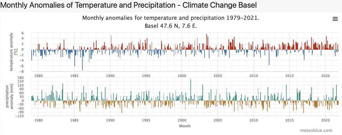
The third chart visualises the monthly anomalies of both temperature (top part) and precipitation (bottom part) for the location you selected (example below).
The last chart enables you to analyse the entire time range from the perspective of individual months, i.e. the total anomalies in temperature (top part) and precipitation (bottom part) aggregated for each month. The example below shows you the anomalies for the month of November, from 1979 to the present (example below).

All of the charts can be downloaded in multiple formats. For more information visit the page .
Of course, some questions remain:
- the data will not show conditions at an exact location. Micro-climates and local differences will not appear. Therefore, temperatures - especially in cities - will be often higher than those displayed, due to the urban heat island effect. Precipitation may vary locally, depending on topography.
- Extreme events are not visible in these data - they may have different frequency, and critical thresholds may be surpassed at a higher frequency. Our history+ service gives you access to the detailled underlying hourly data, for the variables of temperature, precipitation and many more .
- The main question concerns the future: what will be the trend for the next 10-40 years? meteoblue can provide climate risk assessments for the next decades.
We hope that our new diagrams will help you to understand and manage the changes affecting your location, and to deal with the major challenge of climate change. As always, we appreciate your feedback!
